| Script | Description |
|---|---|
| additional_functions.R | Helper functions to render the main paper. |
| 01_attention_check_data_structures.R | Function to generate three- and four- Gaussian clusters data for attention check. |
| 01_data_structure_components.R | Functions to generate data structure components for non-attention check. |
| 02_data_structures.R | Functions to generate three clusters data structure for non-attention check. |
| 03_exp_design_with_method_and_distance_factor.R | Creates the experimental design, varying NLDR method and distance scale factors. |
| 04_exp_design_with_new_ds_factors.R | Extends the experimental design to include additional distance scale factor. |
| 05_gen_clust3_attention_check_data.R | Generates three-cluster data for attention check. |
| 05_gen_cluster3_high_d_data.R | Generates three-cluster data with medium-large distance scale factor. |
| 06_gen_clusters3_with_diff_dist.R | Generates three-cluster data with varying inter-cluster distance scale factors. |
| 09_gen_clusters_merge_all_data.R | Merges all generated cluster data (attention and non-attention check) into a single combined dataset. |
| 10_gen_embeddings.R | Computes multiple NLDR embeddings for specific distance scale factor. |
| 11_comb_emb_default_data.R | Combines NLDR embeddings for all distance scale factors. |
| 12_comb_data.R | Merge all NLDR embeddings generated for attention and non-attention check. |
| 13_data_processing_method_ds_factor_missings.R | Processes collected experimental data and generates the file, containing all relevant details for the same data structure shown in both displays. |
| 13_data_processing_method_ds_factor.R | Processes collected experimental data and generates the file, containing all relevant details for the same data structure shown in both displays. |
| 17_compute_distance_btw_centroids.R | Computes different distance metrics between cluster in the high-dimensional space. |
| 19_find_which_replicates_missing.R | Identifies missing responses across experimental conditions. |
| pwr_analysis_umap_0.1_0.6.R | Power analysis to decide the number of responses needed to detect the difference between UMAP 0.1 and 0.6 distance scale factors. |
| pwr_analysis_tsne_0.1_0.6.R | Power analysis to decide the number of responses needed to detect the difference between tSNE 0.1 and 0.6 distance scale factors. |
Appendix B — Appendix to “Perception and Misperception of Clustering in Nonlinear Dimension Reduction: A User Study”
B.1 Scripts
B.2 Data sets
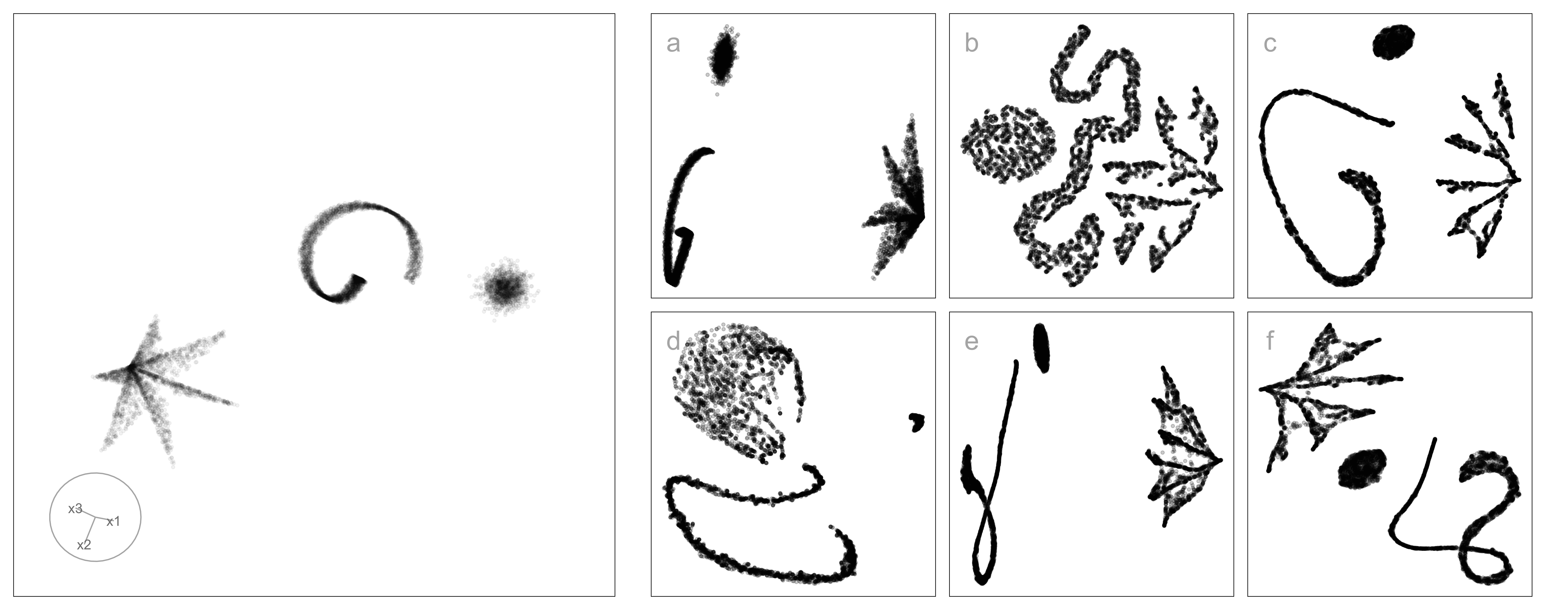
Table B.2 summarizes the three-cluster data sets used in the experiment. Each data set was generated using the cardinalR package (Gamage et al. 2025) and comprises three clusters with distinct structures. The collection of structures spans a wide range of nonlinear, curved, and density-based configurations in 4\text{-}D space, providing controlled yet varied settings for assessing perceptual differences across NLDR methods. All data sets used in this experiment are available at https://github.com/JayaniLakshika/Monash_PhD_thesis/blob/main/data/vis-exp/high_d_data_three_clust_all.rds.
| Data structure | Cluster1 | Cluster2 | Cluster3 |
|---|---|---|---|
| three_clust_01 | curv | elliptical | blunted_cone |
| three_clust_02 | s_curve | cube | pyramid_rectangular_base |
| three_clust_03 | curvy_cylinder | hemisphere | pyramid_triangular_base |
| three_clust_04 | curv2 | Gaussian | filled_hexagonal_pyramid |
| three_clust_05 | nonlinear_hyperbola | elliptical | blunted_cone |
| three_clust_06 | crescent | cube | pyramid_rectangular_base |
| three_clust_07 | nonlinear_hyperbola2 | hemisphere | pyramid_triangular_base |
| three_clust_08 | conic_spiral | Gaussian | filled_hexagonal_pyramid |
| three_clust_09 | helical_hyper_spiral | cube | blunted_cone |
| three_clust_10 | spherical_spiral | Gaussian | pyramid_triangular_base |
| three_clust_11 | curv | elliptical | pyramid_rectangular_base |
| three_clust_12 | s_curve | hemisphere | filled_hexagonal_pyramid |
| three_clust_13 | curvy_cylinder | cube | blunted_cone |
| three_clust_14 | curv2 | Gaussian | pyramid_triangular_base |
| three_clust_15 | nonlinear_hyperbola | elliptical | pyramid_rectangular_base |
| three_clust_16 | crescent | hemisphere | filled_hexagonal_pyramid |
| three_clust_17 | nonlinear_hyperbola2 | cube | blunted_cone |
| three_clust_18 | conic_spiral | Gaussian | pyramid_triangular_base |
| three_clust_19 | helical_hyper_spiral | hemisphere | filled_hexagonal_pyramid |
| three_clust_20 | spherical_spiral | elliptical | blunted_cone |
| three_clust_21 | curv | Gaussian | pyramid_rectangular_base |
| three_clust_22 | s_curve | cube | pyramid_triangular_base |
| three_clust_23 | curvy_cylinder | hemisphere | filled_hexagonal_pyramid |
| three_clust_24 | curv2 | elliptical | blunted_cone |
| three_clust_25 | nonlinear_hyperbola2 | Gaussian | pyramid_rectangular_base |
| three_clust_26 | crescent | cube | pyramid_triangular_base |
| three_clust_27 | nonlinear_hyperbola2 | hemisphere | filled_hexagonal_pyramid |
| three_clust_28 | conic_spiral | elliptical | blunted_cone |
| three_clust_29 | Gaussian | Gaussian | Gaussian |
| three_clust_30 | Gaussian | Gaussian | Gaussian |
Animations of the 4\text{-}D tours that were used for the study’s non-attention check SAME trials, non-attention check DIFFERENT trials, and attention-check trials are available on YouTube at the links given in Table B.3, Table B.4, and Table B.5.
| Data structure | URL |
|---|---|
| three_clust_19 | youtube.com/shorts/fb-gQ064JdI |
| three_clust_20 | youtube.com/shorts/5Lm03LMiC2s |
| three_clust_21 | youtube.com/shorts/BmKzrqTWUbI |
| three_clust_22 | youtube.com/shorts/wrn6lj7-RrQ |
| three_clust_23 | youtube.com/shorts/AWgG3tbfYpA |
| three_clust_24 | youtube.com/shorts/JR_6QorZjj8 |
| three_clust_25 | youtube.com/shorts/gKEZGGZcE6c |
| three_clust_26 | youtube.com/shorts/Ar7OAtuwWsc |
| three_clust_27 | youtube.com/shorts/BXcLP-qqPWo |
| three_clust_28 | youtube.com/shorts/e6cP4jC2xGM |
| Data structure | URL |
|---|---|
| three_clust_29 | youtube.com/shorts/bqZporzHQ5U |
| three_clust_30 | youtube.com/shorts/onAg2AgT2P4 |
B.3 2\text{-}D NLDR layouts
All 2\text{-}D NLDR layouts used in the experiment are available in the supplementary repository: https://github.com/JayaniLakshika/Monash_PhD_thesis/tree/main/figures/vis-exp/layouts. These include all 2\text{-}D embeddings generated under different NLDR methods (tSNE, UMAP, PHATE, TriMAP, and PaCMAP) with default hyper-parameter settings for the simulated 4\text{-}D data sets. All embedding data used to generate the 2\text{-}D NLDR layouts are available at https://github.com/JayaniLakshika/Monash_PhD_thesis/blob/main/data/vis-exp/embedding_data_three_clust_all.rds.
B.4 Distance metrics
To quantify cluster separation in the high-dimensional space, we considered several inter-cluster distance metrics that capture different aspects of separability (Figure B.1). Together, these metrics reflect both global separation between clusters and more local boundary proximity. All distance metrics were computed using standard implementations provided by the fpc (Hennig 2024) R package.
Because the metrics operate on different scales and respond differently to changes in cluster geometry, all distance-based measures were min–max scaled prior to analysis. Several metrics were additionally transformed (using exponential, square-root, or squared transformations) to improve comparability across datasets. These transformations were not intended to alter the interpretation of the measures, but rather to reduce strong nonlinearities and place the metrics on roughly similar scales.
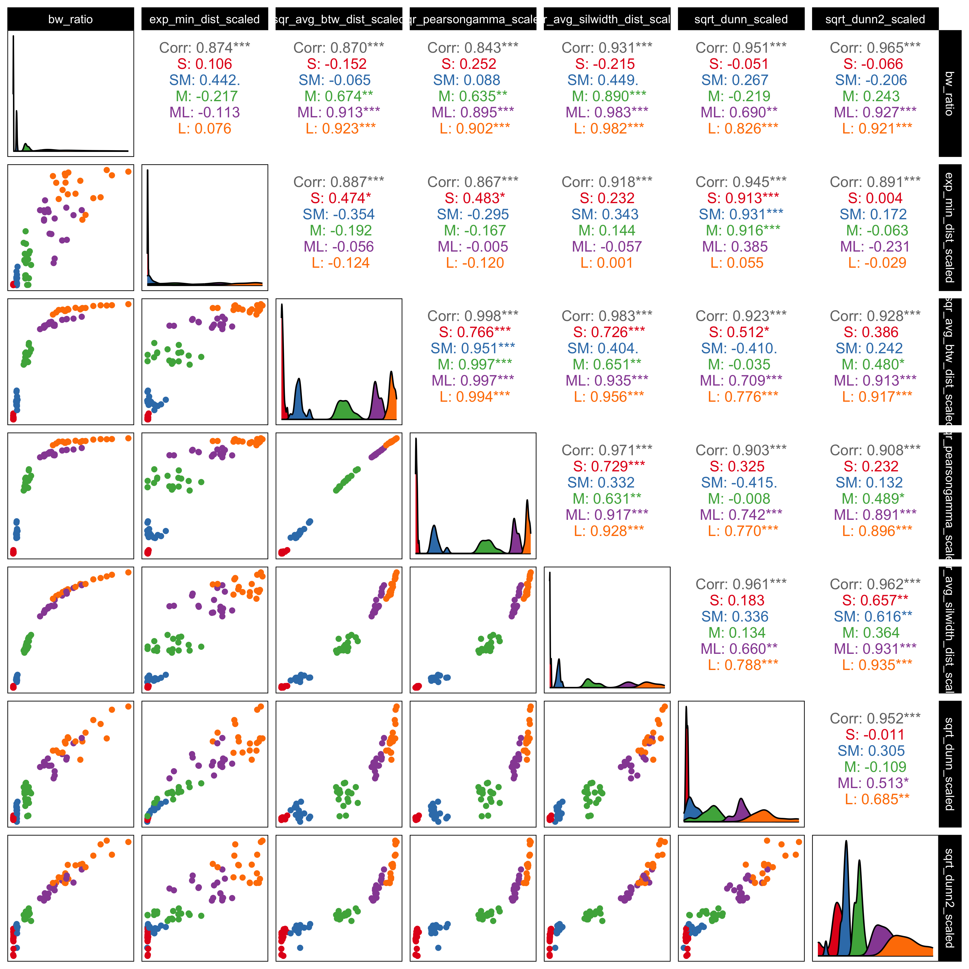
***’). Metrics show high positive correlation, confirming that they capture consistent structural variation. The BW ratio and exponentiated minimum distance were chosen for the main analysis because they provide complementary summaries of global cluster separation and local boundary distance.
As shown in Figure B.1, most metric pairs are strongly positively correlated, indicating that they respond similarly as cluster separation increases. This suggests that the distance scaling used in the simulations effectively controls separability and that the metrics capture related structural changes. The scatterplots also show differences in sensitivity across scaling levels, with some metrics responding more clearly at smaller separations and others providing better discrimination at larger separations.
Based on these patterns, we selected the BW ratio and the exponentiated scaled minimum distance for the main analyses. The BW ratio captures overall separation by contrasting between-cluster and within-cluster dispersion, while the exponentiated minimum distance focuses on the closest boundaries between clusters. Both measures are strongly correlated with the other metrics (upper panels of Figure B.1) but reflect complementary aspects of separability, allowing us to assess whether perceptual accuracy is driven more by global structure, local proximity, or both.
B.5 Determining the number of responses per treatment
Before running the main experiment, we examined how many responses were needed for each treatment (method × distance factor) to reliably detect meaningful differences in performance. Rather than attempting to cover all possible combinations, we focused on representative comparisons that are most informative for the study. In particular, we compared UMAP and tSNE under two distance conditions (0.1 and 0.6), which showed clear differences in correct identification rates in the pilot data.
Using pilot estimates of the correct proportion, we conducted a simulation-based power analysis based on a difference in proportions framework. The baseline probability was taken from the estimated performance at the smaller distance factor (0.1), and a range of effect sizes was explored. We focused on an effect size of approximately 0.22, which corresponds to a change of about 20 percentage points in correct identification and reflects a perceptually meaningful improvement in the ability to distinguish whether two views show the same data.
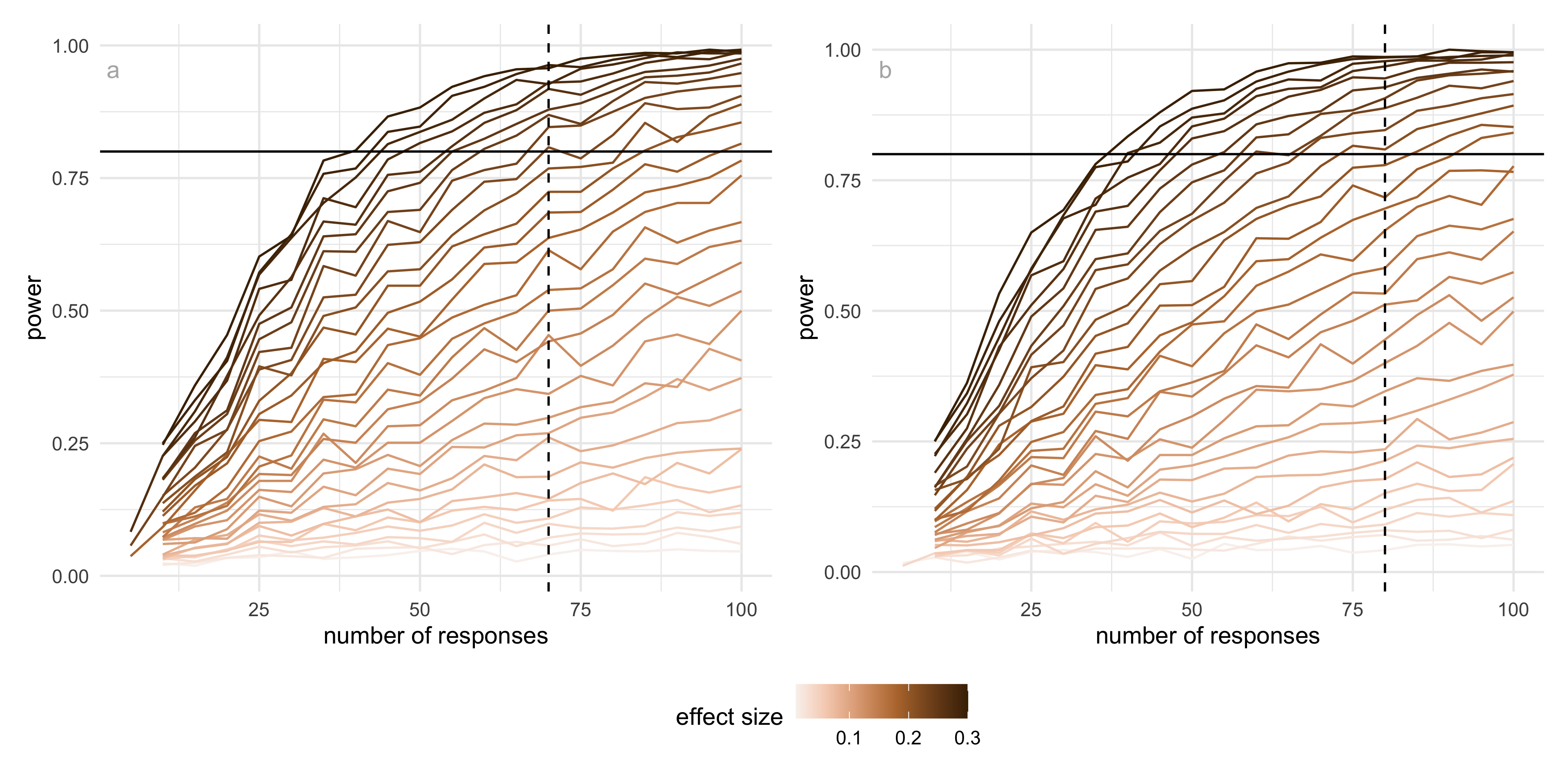
The results show that (Figure B.2), for this effect size, UMAP reaches a detection probability of 0.8 with around 70 responses per condition, while tSNE requires approximately 80 responses to achieve the same level of power. This difference reflects the higher variability observed in tSNE responses compared to UMAP. Importantly, these results indicate that the number of responses collected in the main experiment (typically between 75 and 80 per condition) is sufficient to detect moderate to large effects for both methods.
B.6 Data collection process
Recruit subjects
Subjects were recruited from Prolific (Palan and Schitter 2018), an online platform, to evaluate the trials. The study expects that the subjects are uninvolved judges with no prior knowledge of the data to avoid inadvertently affecting results. Potential subjects needed with fluent in English and have completed at least 10 Prolific studies with a 98\% approval rate. The Prolific server only considers subjects who are age 18 and older.
All subjects were trained using three example displays to orient them to the evaluation trials and provided introductory materials. All subjects who completed the task were compensated 9.96 GBP per hour for their time via the Prolific payment system.
Web application to collect responses
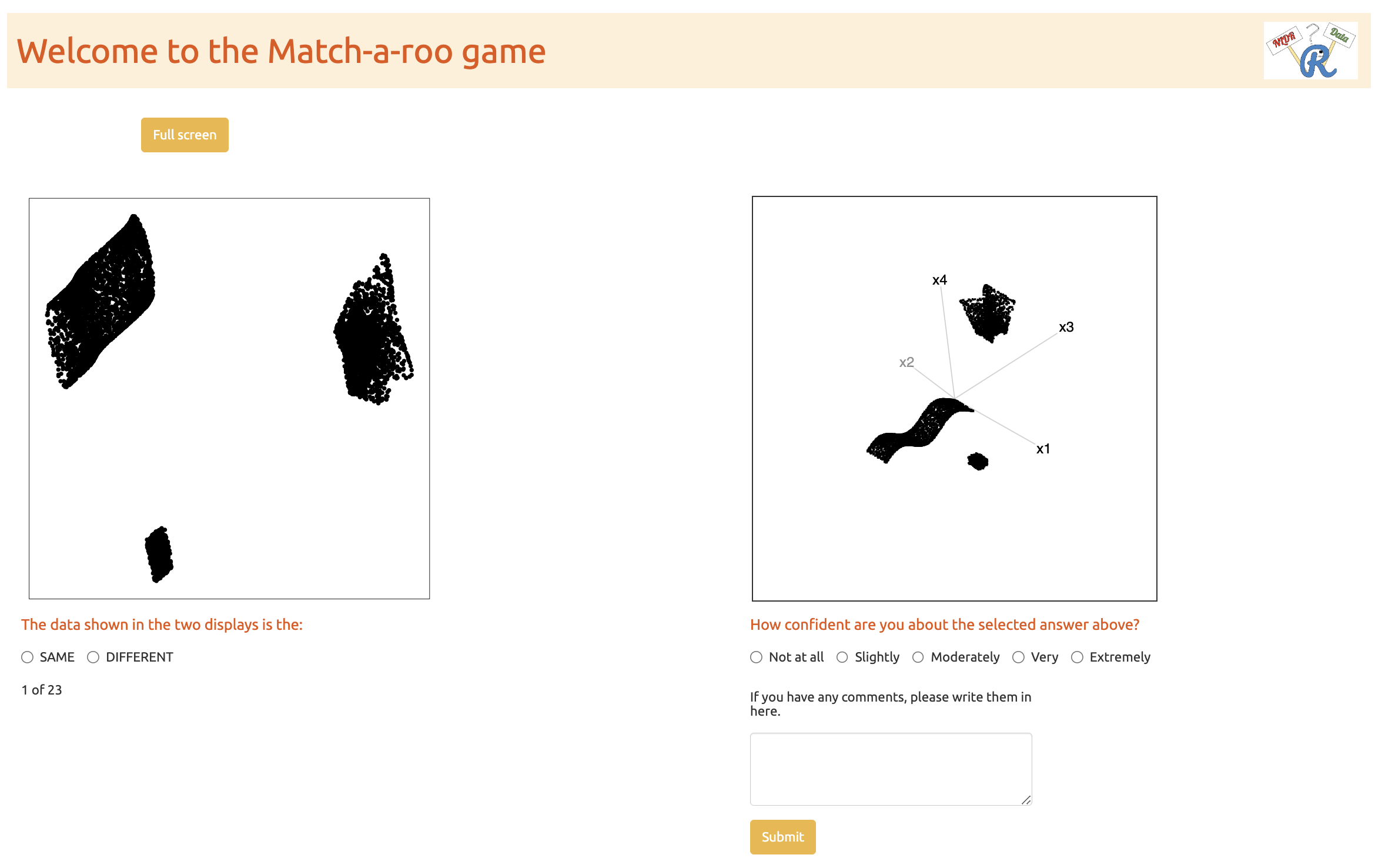
The survey web application, Match-a-roo, is designed to collect survey responses and demographics using the shiny (Chang et al. 2025) package in R. Each subject had access to the survey via the shiny.io server (RStudio, PBC n.d.). The first interface of the survey app contained an introduction, instructions for the survey (Figure B.4), a consent form (Figure B.5), and buttons to access, for example, actual trials. Subjects can try three examples prior to the study where the answers were not recorded (Figure B.6). The subjects were first asked for their consent for the responses to be used for analysis.
A total of 150 participants took part in the study. Of these, 127 completed the attention check correctly, while 23 provided incorrect responses. The analysis was therefore conducted using data from the 127 participants who passed the attention check.
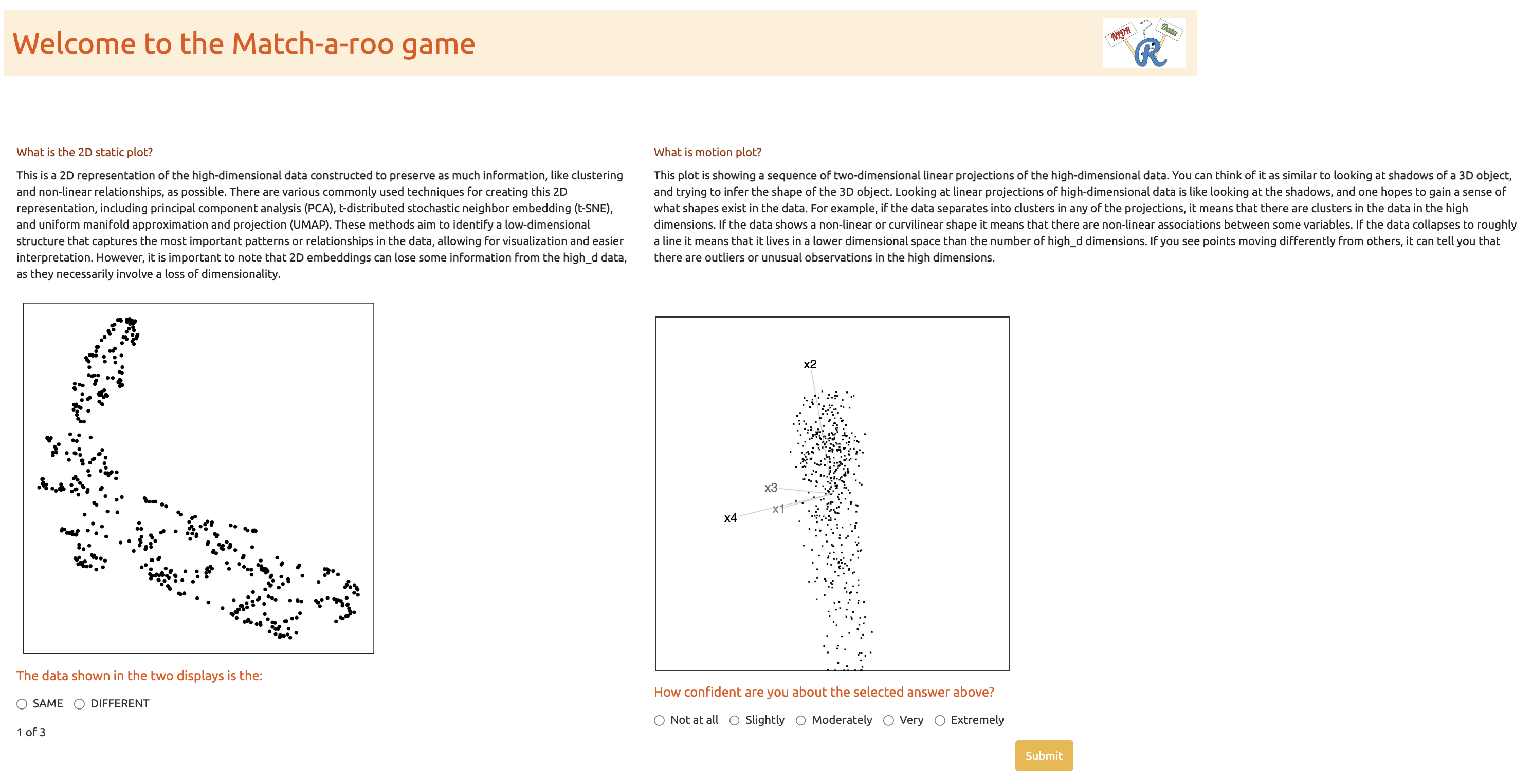
After giving consent, the participant can start the trials. Two visual displays of data are shown, where the data may be the same or different (Figure B.7). One of the visual displays is a 2\text{-}D NLDR plot, and the other is a tour made of many 2\text{-}D plots. The subjects were asked to decide whether the data was the same in both displays and to report their confidence about their choice and any comments about the answer.
When the subjects completed the twenty evaluations, they were asked for their demographics, which included preferred pronoun, the highest level of education achieved, their age category, whether they used principal component analysis in their work, and whether they applied NLDR techniques such as tSNE and UMAP (Figure B.8). Finally, the subjects need to click on the prolific URL (https://app.prolific.co/submissions/) to redirect back to the Prolific app (Figure B.9).
. The first interface of the survey app contained an introduction, instructions for the survey (@fig-intro-page), a consent form (@fig-consent), and buttons to access, for example, actual trials. Subjects can try three examples prior to the study where the answers were not recorded (@fig-example). The subjects were first asked for their consent to the responses being used for analysis.](../figures/vis-exp/introduction.png)


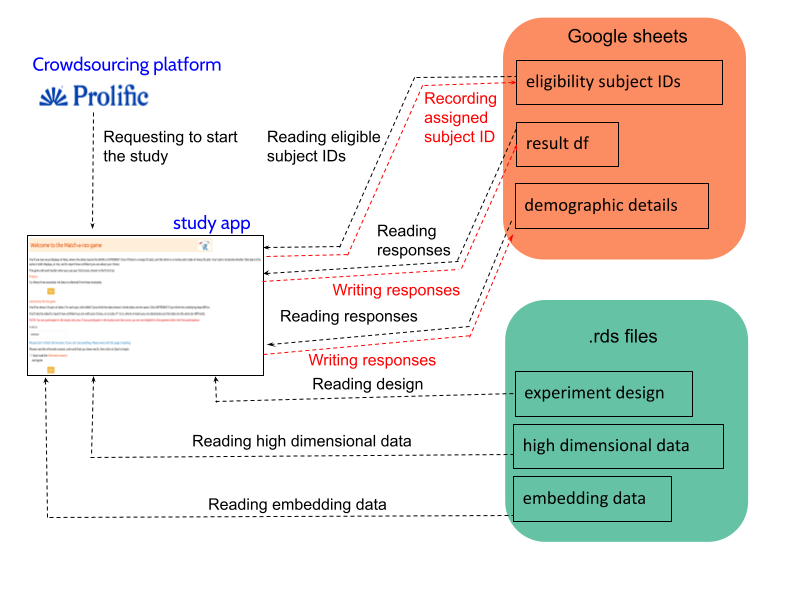
Once a participant starts the study (Figure B.3), the “eligibility_subject_IDs” Google Sheet is connected and read in the Shiny app to identify which subject IDs have not yet been assigned to anyone, as indicated by the “used” column. If the “used” column is marked as NA, it means that the subject ID has not been assigned.
After identifying the eligible subject IDs, one is randomly assigned to the participant, and “1” is recorded in the “used” column corresponding to that subject ID. This subject ID will later assist in connecting the experiment design, high-dimensional data, and embedding data.
Once a subject ID is allocated to a participant, the experiment design data are loaded, and the relevant attempts, data structure, and methods are presented to the participant. This process continues until the participant completes all attempts. After determining the data structure and methods, the relevant high-dimensional and embedding data are loaded from “high_d_data_three_clust_all.rds” and “embedding_data_three_clust_all.rds”, respectively, and displayed in both tour and 2\text{-}D NLDR plots.
Once the participant records their answers, a new row is added to the “result_df” Google Sheet with their responses. This continues until the participant finishes the study. Finally, after completing the evaluations, subjects are asked to fill out a demographics questionnaire. Their responses are then recorded in a new row of the “demographic_details” Google Sheet.
B.7 Preliminary Assessment of PCA Layouts
PCA layouts were considered during the study design and tested in a preliminary phase with a small group of participants (18 subjects). Each participant evaluated three PCA layouts, giving a total of 54 responses. Of these, approximately 91\% were correctly identified, substantially higher than the correct identification rates observed for the NLDR methods (tSNE, UMAP, PHATE, TriMAP, and PaCMAP) in the main experiment. This indicates that PCA layouts of the simulated 4\text{-}D data were comparatively easy to interpret when shown alongside the tour (Figure B.10). This is likely because the simulated data consisted of only three well-separated clusters in 4\text{-}D, and PCA projections preserved much of the relative positioning of the clusters. Since PCA is itself a linear projection of the data, the layouts also closely resembled views observed in the tour. In contrast, NLDR methods such as tSNE, UMAP, PHATE, TriMAP, and PaCMAP can substantially alter the geometry of the data, making identification more challenging. Therefore, the main experiment focused on NLDR methods, where perceptual differences are more informative.
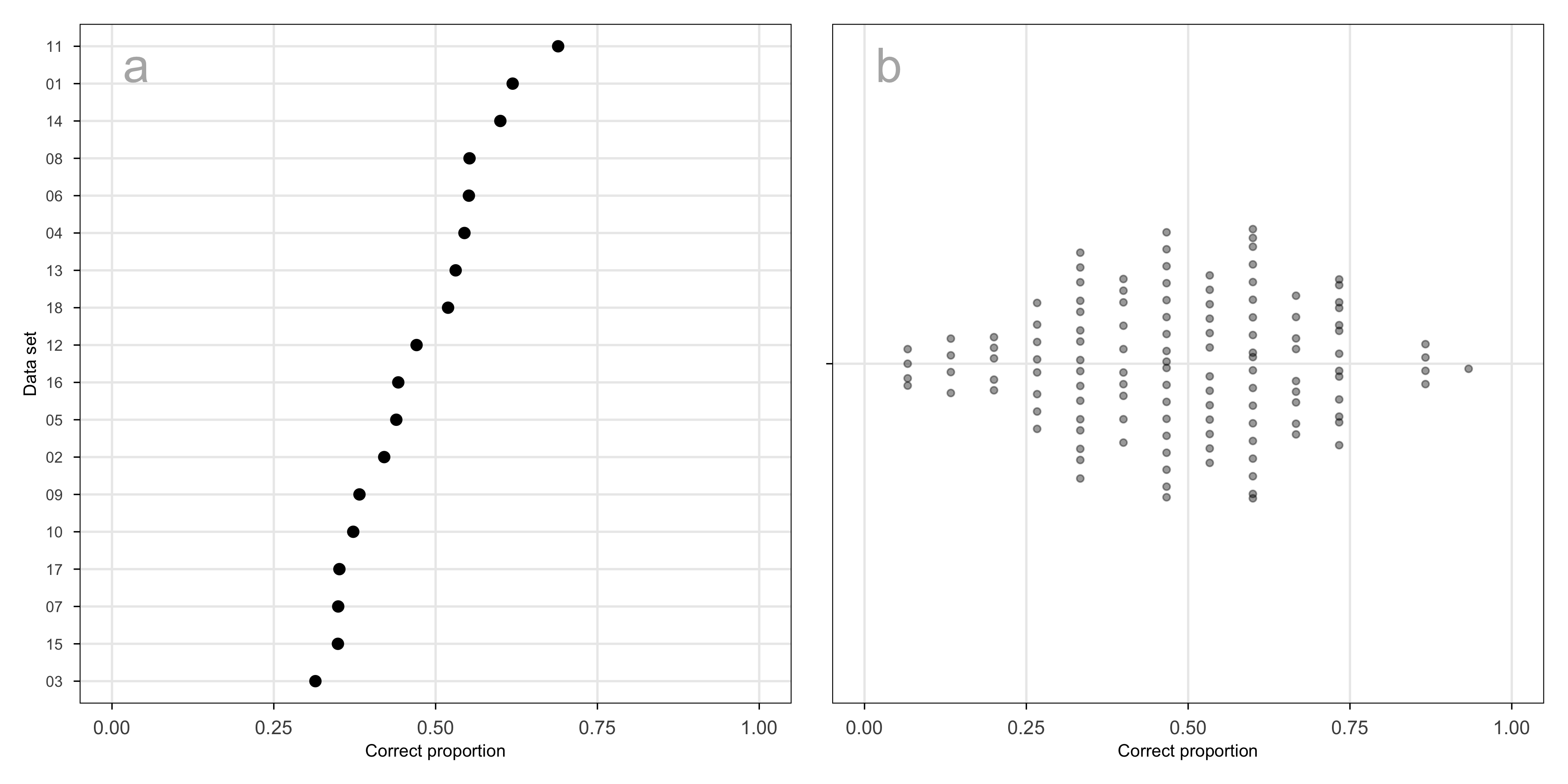
B.8 Variability across data sets and subjects
Two sources of variability in the experimental design that are important to assess relative to the fitted model: data sets and subjects. Data sets are effectively treated as replicates in the experiment, providing random samples of a range of types of clusters. Humans have different perceptual skills, which is why it is important to include a subject random effect in the model.
Across the data sets used in the experiment, the proportion of correct responses ranges from approximately 0.3 to 0.7 (Figure B.11 a). Because data sets were assigned at random, in a way unrelated to other factors in the experiment, this represents a source of variation that can safely be treated as noise.
The proportion correct across subjects is symmetric and unimodal, reasonably consistent with the assumption that they are normally distributed random effects (Figure B.11 b). Some subjects performed extremely well, and others poorly. This is similar to what has been observed in other human subject experiments involving visual tasks. A high score could be obtained by selecting SAME on each trial, but this was not the case when all their data was examined.
B.9 Analysis of results relative to the data collection process
Data cleaning
The initial step in the data cleaning process involves the selection of subjects who have completed the requisite twenty trials, including the demographics and the attention check trial. The attention check trials were removed, as they did not contribute to the further analyses. Finally, the collected data set was refined by selecting responses from trials in which the 2\text{-}D NLDR layout and the tour represented the same underlying data, allowing us to assess participants’ ability to correctly identify the same data structures across the displays.
Demographics
Along with the responses to the trials, we have collected a series of demographic information, including preferred pronoun, age range category, educational background, and previous experience in PCA and Non-linear dimension reduction techniques. Table B.6, Table B.7, Table B.8, Table B.9, and Table B.10 provide summaries of the demographic data.
The subjects are fairly balanced in terms of pronouns, with similar proportions identifying as she/her (50.4\%) and he/him (48.0\%), and a small number identifying as they/them (1.6\%). Subjects cover a wide age range, with most between 25 and 34 years old (35.4\%), followed by those aged 18-24 (20.5\%) and 35-44 (19.7\%). The sample has more younger and mid-adult age groups, while still including representation from older subjects.
Most subjects have completed an undergraduate degree (44.9\%) or a postgraduate qualification (26.8\%), with others reporting some undergraduate study (21.3\%). Only a small proportion did not complete high school. Prior experience with dimension reduction methods is limited: the majority report no previous experience with PCA (84.2\%) or nonlinear dimension reduction techniques (86.6\%). This suggests that most subjects approached the task without strong prior familiarity, allowing the results to reflect general perceptual interpretation rather than expert knowledge.
| Pronoun | Period I | Period II | Total | % |
|---|---|---|---|---|
| he/him | 7 | 54 | 61 | 48.03 |
| she/her | 11 | 53 | 64 | 50.39 |
| they/them | 0 | 2 | 2 | 1.57 |
| Total | 18 | 109 | 127 | 100.00 |
| Age group | Period I | Period II | Total | % |
|---|---|---|---|---|
| 18 - 24 | 3 | 23 | 26 | 20.47 |
| 25 - 34 | 9 | 36 | 45 | 35.43 |
| 35 - 44 | 3 | 22 | 25 | 19.69 |
| 45 - 54 | 1 | 12 | 13 | 10.24 |
| Over 55 | 2 | 16 | 18 | 14.17 |
| Total | 18 | 109 | 127 | 100.00 |
| Education | Period I | Period II | Total | % |
|---|---|---|---|---|
| Did not complete high school | 0 | 4 | 4 | 3.15 |
| Completed some undergraduate courses | 4 | 23 | 27 | 21.26 |
| Undergraduate degree (A bachelor) | 8 | 49 | 57 | 44.88 |
| Higher degree master or doctorate | 3 | 31 | 34 | 26.77 |
| Prefer not to answer | 3 | 2 | 5 | 3.94 |
| Total | 18 | 109 | 127 | 100.00 |
| Experience with PCA | Period I | Period II | Total | % |
|---|---|---|---|---|
| No | 15 | 92 | 107 | 84.25 |
| Yes | 3 | 17 | 20 | 15.75 |
| Total | 18 | 109 | 127 | 100.00 |
| Experience with NLDR | Period I | Period II | Total | % |
|---|---|---|---|---|
| No | 15 | 95 | 110 | 86.61 |
| Yes | 3 | 14 | 17 | 13.39 |
| Total | 18 | 109 | 127 | 100.00 |