5 Perception and Misperception of Clustering in Nonlinear Dimension Reduction: A User Study
Nonlinear dimension reduction (NLDR) methods such as tSNE, UMAP, PHATE, TriMAP, and PaCMAP are popular ways to visualize high-dimensional data, yet their effectiveness for conveying structure remains mysterious. Many factors might contribute to perceptual miscommunication, which for cluster structure, may include how their shapes are represented, the degree of separation, or even the number of clusters. This study evaluates how well NLDR methods preserve perceptually meaningful cluster structure using a human subject experiment with simulated data having three clusters with distinct geometries, unequal sizes, and varying inter-cluster separation. Subjects were asked whether a 2\text{-}D NLDR layout and a tour of linear projections showed the same high-dimensional data. Cluster separation was controlled for the study to be the distance between means, but for analyzing the results, two additional measures, the between-within (BW) ratio and the exponentially scaled minimum inter-cluster distance, were used to account for highly nonlinear shapes. The results suggest interesting differences across methods. For example, UMAP and tSNE represent the distance between clusters distinctly differently, resulting in data being interpreted differently. These findings highlight the need for more studies to assess NLDR methods based on how effectively their visualizations support human perception of high-dimensional structure.
5.1 Introduction
Nonlinear dimension reduction (NLDR) is popular for making a suitable 2\text{-}D representation of high-dimensional (p\text{-}D) data by applying nonlinear transformations. Recently developed methods include t-distributed stochastic neighbor embedding (tSNE) (Maaten and Hinton 2008), uniform manifold approximation and projection (UMAP) (McInnes et al. 2018), potential of heat-diffusion for affinity-based trajectory embedding (PHATE) algorithm (Moon et al. 2019), large-scale dimensionality reduction using triplets (TriMAP) (Amid and Warmuth 2022), and pairwise controlled manifold approximation (PaCMAP) (Wang et al. 2021).
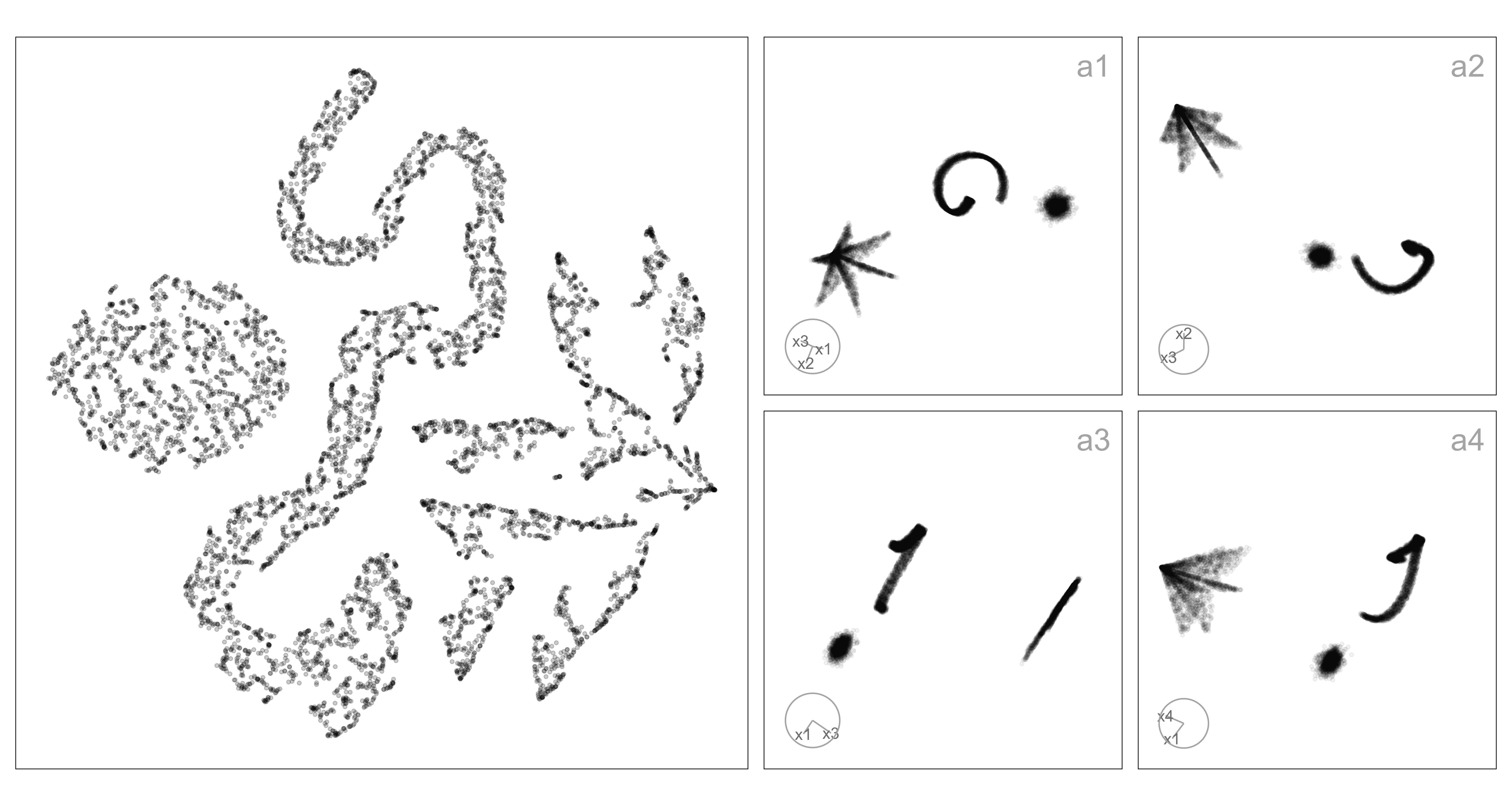
Nonlinear transformations allow for multiple shape-varying clusters to be represented in a single 2\text{-}D layout. In contrast, classical linear projection will often require multiple projections to show multiple clusters. Figure B.10 illustrates this: a1-a4 show linear projections revealing three well-separated clusters, one spherical, one ribbon-like, and one like a star-shaped pyramid. The NLDR layout (left) is generated using tSNE and has a mostly reasonable display of the three clusters in a single view, although it struggles with the star pyramid. It does place the clusters very close to each other, which does not reflect the large separation in the high-dimensional space.
In general, the dilemma for the analyst is to make the conceptual leap from the structure displayed in the NLDR layout to what exists in high dimensions. From Figure B.10 we might find that the analyst correctly conceptualizes the existence of the spherical and ribbon clusters, but mistakenly considers them close in high dimensions. The star-shaped pyramid might be incorrectly conceptualized as a lot of small clusters, possibly triangular in shape. This is what the work presented here is attempting to assess: whether the conceptualization from the NLDR reasonably matches that gained by viewing the same data using a tour of linear projections.
The chapter is organized as follows. Section 5.2 provides a summary of the literature on NLDR, high-dimensional data, and visualization methods. Section 5.3 describes the experiment designed to examine people’s perception to assess how viewers recognize structure differently from a 2\text{-}D NLDR layout and the tour view. Section 5.4 discusses the collected data, results, and reasons for misperception. Limitations are provided in Section 5.5. A discussion of the presented work and ideas for future directions is described in Section 5.6.
5.2 Background
Historically, 2\text{-}D nonlinear representations of p\text{-}D data have been obtained through versions of multidimensional scaling (MDS) (originally defined by Kruskal (1964), and see Borg and Groenen (2005) for a modern overview) and linear representations using principal component analysis (PCA) (for an overview see Jolliffe (2011)). MDS aims to construct a low-dimensional (usually 2\text{-}D) layout that preserves pairwise distances between observations in the original space by minimizing a stress function. Challenges such as distance concentration that lead to difficulties for interpretation have been documented by Johnstone and Titterington (2009).
NLDR methods have been developed to improve on MDS with varying degrees of preserving local and/or global structures of p\text{-}D data, with some modern methods being tSNE, UMAP, PHATE, TriMAP, and PaCMAP. Each method uses different underlying principles. For example, tSNE and PHATE emphasize local relationships, while TriMAP and PaCMAP are designed to better capture global structure. As a result, these methods can produce very different 2\text{-}D layouts of the same data, potentially leading to misinterpretation of structures such as cluster separation.
An alternative to NLDR for visualizing p\text{-}D data is to use linear projections. PCA is the classical approach, producing new variables as linear combinations of the original dimensions. While PCA provides a single static projection that maximizes variance, tours introduced by Asimov (1985) extend this idea by generating smooth sequences of linear projections, effectively creating a movie of the data viewed from multiple directions. Tours can reveal structures that may be hidden in any single projection by continuously changing the viewing angle through high-dimensional space. Many tour algorithms have since been developed and are implemented in the R package tourr (Wickham et al. 2011), with interactive variants available in langevitour (Harrison 2023) and detourr (Hart and Wang 2025). Tours are valuable because they preserve the geometry of the data, unlike NLDR methods - they do not warp distances or angles. This makes them faithful but sometimes visually cluttered representations: global structure can obscure local detail, and the phenomenon of piling (Laa et al. 2022), where high-dimensional points project toward the center, can make clusters harder to distinguish.
Quantifying clusters in shape and separation is not simple. For this experiment, a variety of shapes were generated using the functions in the cardinalR package (Gamage et al. 2025). Cluster separation can be summarised using measures such as the between–within (BW) ratio, which captures global separability under assumptions of approximately spherical cluster structure. A variety of distance-based metrics have been proposed in the clustering and visualization literature (Calinski and Harabasz 1974; Davies and Bouldin 1979; Rousseeuw 1987), including minimum, maximum, and average distances between clusters, centroid distances, and ratios that combine between- and within-cluster variation. Although the data sets were created with a fixed process, the results will be examined with a variety of distance metrics to capture NLDR behavior using different lenses of separation.
The objective of this research is to study analyst perception of clustering structure in a 2\text{-}D NLDR layout comparison with that from a tour of the same high-dimensional data. The tour is generated using langevitour. The primary factor of interest is how the perception changes when cluster separation increases.
5.3 Methods
Although there are many aspects of NLDR and perception of data structure to assess, for this work, we restrict attention to the distance between clusters. For a range of cluster shapes, the distance between clusters is varied, and NLDR layouts are generated by the commonly used methods with default settings. The conceptualization of clustering is tested by showing subjects two views (one NLDR layout and the tour of linear projections) and asking whether both show the same data. When the response is that they are the same, it is interpreted as that they conceptualize the clustering in both similarly. Conversely, if the response is that the two are different, it is interpreted as a different conceptualization.
It is worth noting that a “same” response reflects perceived visual similarity rather than logical certainty. A given 2\text{-}D NLDR layout is not uniquely determined by a single dataset, so participants can judge whether the two views appear consistent, but cannot rule this out with certainty.
Data generation
A total of 30 4\text{-}D data sets are generated. Two are reserved as an attention check used to determine if the subject conscientiously attempted the task. All data sets were standardized prior to NLDR and are shown in the tour.
Non-attention check data
For the experiment, three cluster data sets are generated. The three clusters contain different numbers of points and shapes. Let C_1, C_2, and C_3 denote the centroids of three clusters. The pairwise distances between these centroids are calculated as: d(C_1, C_2) = c_{12},~d(C_1, C_3) = c_{13}, \text{ and } d(C_2, C_3) = c_{23}. At the original distance scale (scale factor 1, referred to as medium-large), clusters C_1 and C_2 are in close proximity, while cluster C_3 is positioned farther away, creating an asymmetric separation pattern. Centroid distances were used because they provide a simple and controllable way to adjust overall cluster separation.
The experiment consists of two types of trials: SAME trials and DIFFERENT trials. In SAME trials, two visualizations (one NLDR layout and the tour) are generated from the same underlying dataset, but with controlled variations in cluster separation. In DIFFERENT trials, the two visualizations are generated from different datasets.
In the SAME trials, the degree of separation between clusters was varied by multiplying the original centroid distances by four scale factors: 0.1 (small), 0.6 (small-medium), 0.9 (medium), and 1.1 (large). These values were chosen to span a range of perceptual difficulty from cases where clusters are expected to overlap strongly and be hard to distinguish (0.1), through intermediate levels where separation is visible but ambiguous (0.6 and 0.9), to cases where clusters are clearly separated (1.1). Using proportional scaling ensures that the relative geometry of the data is preserved while systematically controlling how strongly separation cues are expressed.
In contrast, data structures used for the DIFFERENT trials retained the original centroid distances (scale factor 1) without modification. This allows the DIFFERENT trials to serve as stable reference cases while ensuring that variation in separation is introduced only in trials where participants are asked to judge whether two displays show the same data.
Shapes for each cluster were selected randomly from a predefined set of curved, linear, and volumetric structures, including S-curves, crescents, spirals, hyperbolic and cylindrical shapes, as well as geometric solids such as cubes, hemispheres, pyramids, cones, and Gaussian clusters.
Attention check data
The attention-check datasets were designed to be simple and easily interpretable, with clearly separated cluster structures that should be consistently recognized across visualizations. These datasets serve as a basic validation to ensure participants are attentive and understand the task.
Each cluster was generated from a multivariate normal distribution with predefined mean vectors and a common isotropic covariance structure. Specifically, the covariance matrix for each cluster was taken as (\sigma^2 I), where (\sigma^2 = 0.1) and (I) is the identity matrix, implying equal variance in all dimensions and no correlation between variables.
For the three-cluster case, the mean vectors were [1,0,0,0], [0,1,0,0], and [0,0,1,1]. For the four-cluster case, the means were [1,0,0,1], [0,1,1,0], [1,0,1,0], and [0,1,0,1]. Each dataset consists of (4\text{-}D) observations with a total sample size of 7500, equally divided among clusters.
Organization of SAME and DIFFERENT trials
Although the main analysis focuses on trials where the same data are shown in both displays, it is essential to include DIFFERENT trials in the experiment. Without them, participants could rely on a trivial strategy—such as always responding “SAME” and still achieve high accuracy. DIFFERENT trials, therefore, act as a necessary control, ensuring that correct responses in SAME trials reflect genuine perceptual agreement between the NLDR layout and the tour rather than response bias or guessing.
Therefore, the experiment was designed to include a mixture of SAME, DIFFERENT, and attention check trials. In total, 28 non–attention check data structures were used. Of these, 18 data structures were assigned to SAME trials, where the same high-dimensional data structure was used to generate both the 2\text{-}D NLDR plot and the tour. These trials are the primary focus of the analysis.
The remaining 10 data structures were used to create DIFFERENT trials. In these cases, the NLDR plot and the tour were generated from two distinct but related data structures. For example, when data structure three_clust_19 appeared in the NLDR plot, three_clust_20 was shown in the tour. Although these DIFFERENT trials are not analyzed directly, they play a crucial role in maintaining the integrity of the task by preventing systematic response strategies.
In addition, two clearly separable Gaussian cluster data sets were included as attention checks. These appear as both SAME and DIFFERENT trials and are used to verify that participants are paying attention and are able to perform the task under easy conditions.
To avoid learning and familiarity effects, each participant sees each data structure only once. Data sets were therefore assigned to subjects randomly but without replacement at the subject level. This ensures that participants cannot rely on memory from earlier trials and that each judgment is based solely on the visual information presented.
Experiment design
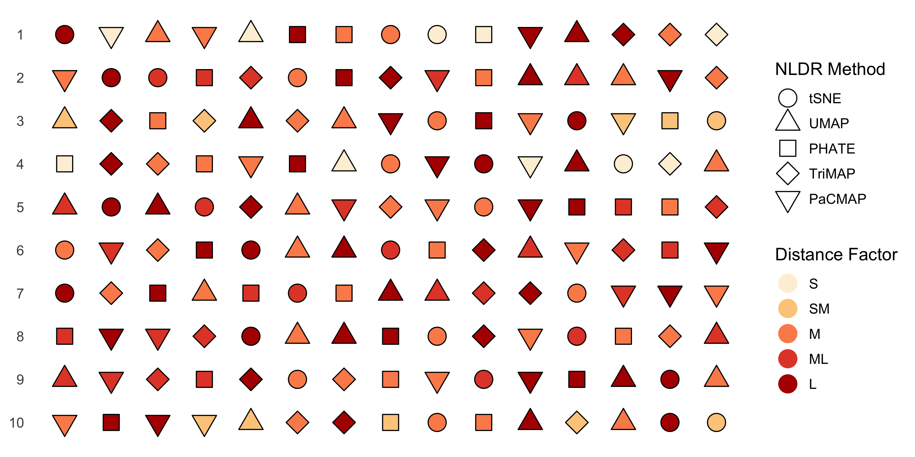
The visual layout of the experiment for five subjects is shown in Figure 5.2. Each subject completed 20 trials: 15 SAME trials, in which the same data structure was shown in both the 2\text{-}D NLDR plot and the tour; 4 DIFFERENT trials, showing DIFFERENT data structures; and one attention check trial that could be either SAME or DIFFERENT. The purpose of the DIFFERENT trials was to ensure that subjects didn’t get too familiar with the task, which might happen if the data were always the same in both graphics. For the SAME, five NLDR methods (tSNE, UMAP, PHATE, PaCMAP, and TriMAP) were each paired with three of five distance scale factors (small, small-medium, medium, medium-large, and large), giving 15 balanced combinations. In the DIFFERENT, four NLDR methods were randomly selected, with the remaining method assigned to the attention check trial. All DIFFERENT and attention check trials used a distance scale factor of medium-large.
Experimental factors
Two factors of interest were considered in the experiment: the NLDR method and the distance scale factor.
The first factor consisted of five NLDR methods: tSNE, UMAP, PHATE, PaCMAP, and TriMAP, each producing a 2\text{-}D representation.
The second factor, the distance scale factor, controlled the degree of cluster separation in the high-dimensional space. Five categorical levels: small, small–medium, medium, medium–large, and large were defined to represent increasing degrees of separability. This categorical design enhances interpretability and perceptual distinctness, allowing subjects to discern meaningful structural differences while maintaining robustness against minor data variations.
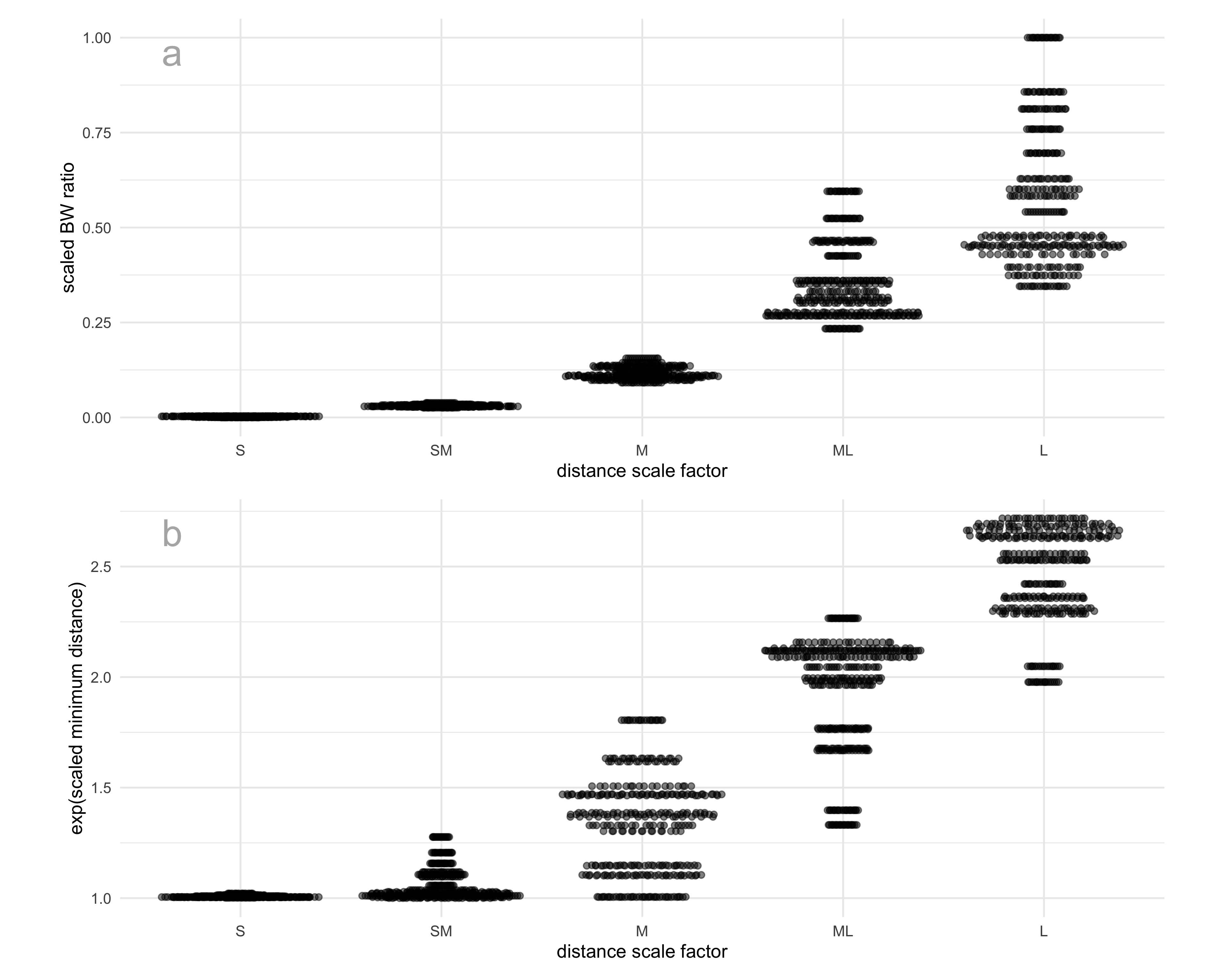
In our analysis of the results, we decided to quantify the distances between clusters numerically rather than using the distance scale factor levels directly. Cluster separability was quantified using two complementary measures: the between-to-within (BW) ratio and the minimum inter-cluster distance. A higher value of either metric indicates greater separation among clusters (Figure 5.3). To ensure comparability across datasets with different underlying structures, all distance-based metrics were min–max scaled prior to analysis.
The BW ratio, defined as
\text{BW ratio} = \frac{\bar{d}_{\text{between}}}{\bar{d}_{\text{within}}},
where \bar{d}_{\text{between}} denotes the average between-cluster distance and \bar{d}_{\text{within}} denotes the average within-cluster distance. The within-cluster distance is computed as the weighted mean of pairwise distances within each cluster, while the between-cluster distance is the mean of all pairwise distances between observations from different clusters.
In addition, the minimum distance was used as a complementary measure of global separation:
\text{minimum distance} = \min_{k \neq \ell}\min_{\mathbf{x}_i \in C_k,\mathbf{x}_j \in C_l} d(\mathbf{x}_i, \mathbf{x}_j),
where d(\cdot,\cdot) denotes the Euclidean distance, C_i is the i^{th} cluster with n_i observations, \bar{\mathbf{x}}_i is the centroid of cluster C_i. This metric captures the closest proximity between any two clusters. The scaled minimum distance was exponentiated so that, where it agrees with the BW ratio, the relationship between the two measures is approximately linear. The transformation increases separation among larger distance values while leaving small distances largely unchanged, facilitating more comparable variation across datasets.
Subject recruitment
Subjects were recruited from the Prolific crowd-sourcing platform (Palan and Schitter 2018). The study expects that the subjects are uninvolved judges with no prior knowledge of the data to avoid inadvertently affecting results. Pre-screening procedures were applied the recruitment: potential subjects needed with fluent in English and have completed at least 10 Prolific studies with a 98\% approval rate.
Data collection
The survey web application, Match-a-roo, was used for data collection. Subjects provided the introduction and instructions for the survey. Before starting the survey, the subjects can be led to the “example” page, which allows them to experiment with the data collection interface and practice deciding whether the two displays show the same data or not. The main purpose of using the “example” was merely to familiarize the subjects with the questions that would be asked, as well as the process of deciding whether the two displays showed the same data or not. The interface did not provide any numeric feedback as to subject correctness.
The subjects were asked to provide their Prolific ID and their consent to the responses being used for analysis. After giving consent, the subject can start the trials. Two visual displays of data were shown, where the data may be the SAME or DIFFERENT. One of the visual displays is a 2\text{-}D NLDR plot, and the other is a tour. The subjects were asked to decide whether the data was the same in both displays and to report their confidence about their choice and any comments about the answer.
After completing 20 evaluations, they were asked for their demographics, which included preferred pronoun, the highest level of education achieved, their age category, whether they used principal component analysis in their work, and whether they applied NLDR techniques such as tSNE and UMAP.
Generalized linear mixed-effects models
Two generalized linear mixed effects models (McCulloch et al. 2001) were fitted to model the likelihood of detecting the data structure in both the 2\text{-}D NLDR layout and the tour (Equation 5.1). Both models accounted for subject-level variability and the effect of distance measures under different NLDR methods. The general form of the model is given by:
\text{logit}(P(y_{ijm} = 1)) = \mu_{m} + \beta_{m} d_{i} + \gamma_{j}, \tag{5.1}
where \mu_{m} is the intercept, d_i is the distance measure for the data structure i = 1, \dots, 18, \beta_m is the fixed effect of distance metric under NLDR method m, \gamma_j is the random effect of the subject j = 1, 2, \dots, 127, where \gamma_j \sim N(0, \sigma_\gamma^2). Separate models were fitted using d_i as either the scaled BW ratio or the exp(scaled minimum distance). The NLDR methods denoted by m can include TriMAP, UMAP, PaCMAP, tSNE, and PHATE. The models were fitted using the lme4 package (Bates et al. 2015) and examined with the emmeans package (Lenth 2025).
5.4 Results
The data was collected from 127 subjects, resulting in 127 \times 15 = 1905 evaluations, excluding the attention check trials and the trials showing the different data in two displays.
While we expected correct identification to improve as cluster separation increases, this was not consistently observed across all methods. The range of estimated probabilities throughout this chapter should therefore be interpreted as an informative signal of how different NLDR methods convey cluster separation to human observers, rather than an indication of poor model fit.
Effect of method and distance between clusters
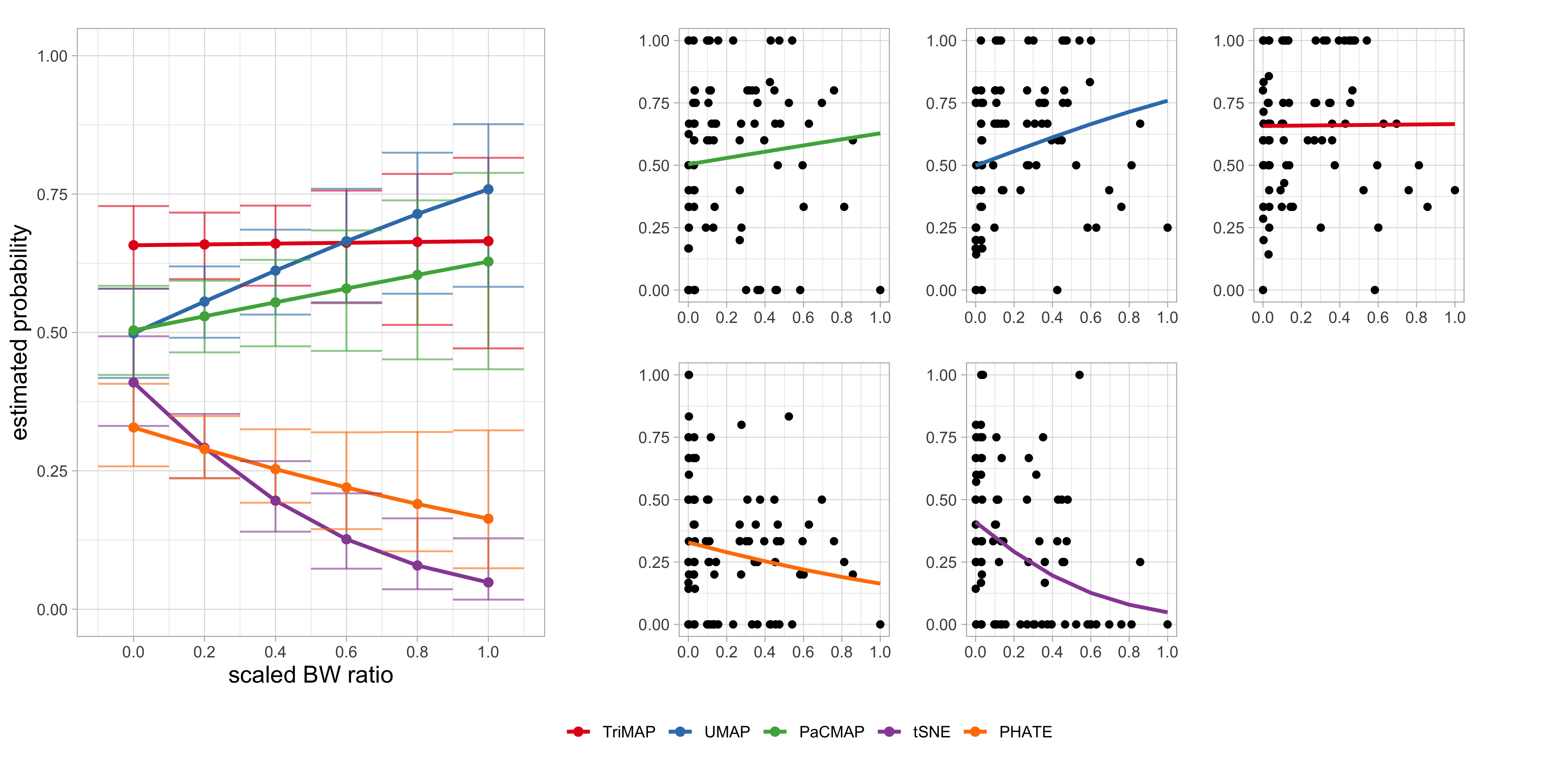
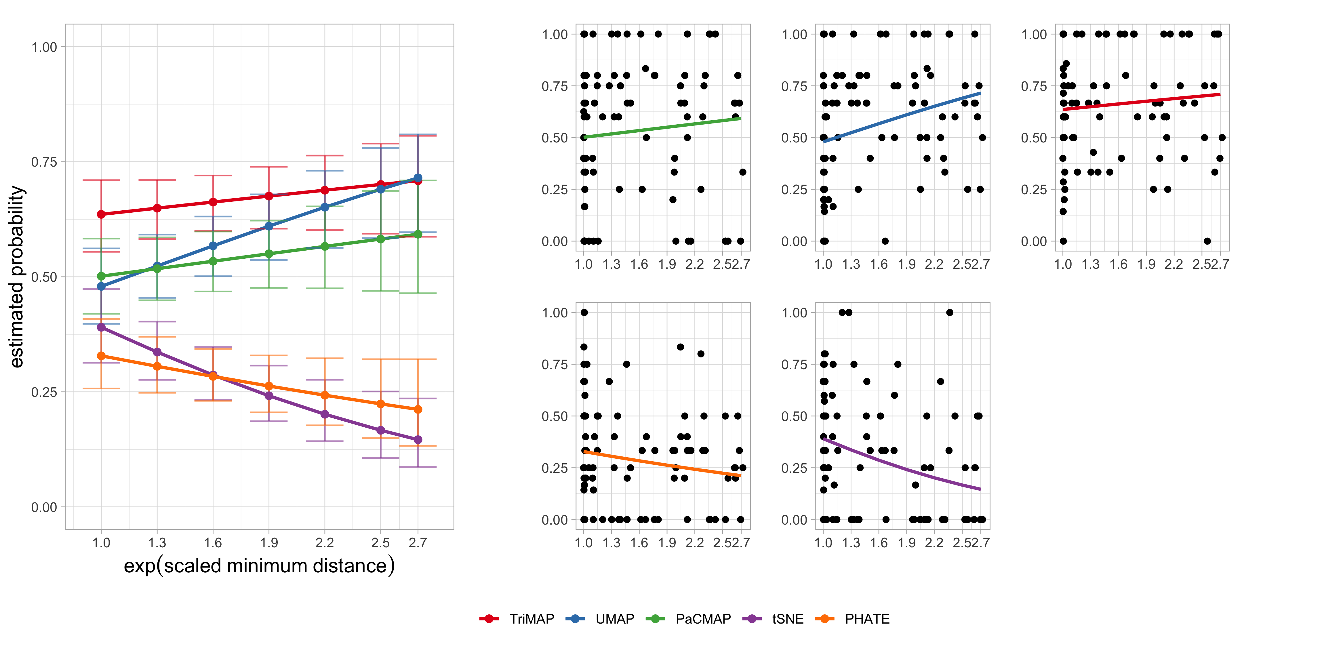
The proportion of correct identifications across the NLDR methods and distance conditions was analysed to evaluate how effectively each method preserves cluster separation. Results are summarized using two generalized linear mixed-effects models, with either the scaled BW ratio (Figure 5.4, Table 5.1) or the exp(scaled minimum distance) (Figure 5.5, Table 5.2) as the distance predictor. Both models accounted for subject-level variability through random effects and included the NLDR method as a fixed factor interacting with the distance measure.
Results from the model using the scaled BW ratio (Table 5.1) indicate that cluster separability positively influences correct identification for some NLDR methods. As shown in Figure 5.4, UMAP exhibits a clear increase in accuracy as the scaled BW ratio increases, suggesting that this method benefits from greater between-cluster separation. PaCMAP shows a positive but weaker trend, while TriMAP maintains stable performance across the range of separations. In contrast, tSNE and PHATE display declining accuracy at higher BW ratios, indicating that increased separation may distort or obscure structural cues for these methods.
***’, \emph{p}\leq 0.01 ‘**’, \emph{p}\leq 0.05 ‘*’, \emph{p}\leq 0.1 ‘.’).
| Method | Slope | SE | 95% CI | z | p |
|---|---|---|---|---|---|
| TriMAP | 0.03 | 0.49 | [-0.92, 0.99] | 0.07 | 0.95 |
| UMAP | 1.15 | 0.49 | [0.19, 2.11] | 2.35 | 0.02 * |
| PaCMAP | 0.51 | 0.48 | [-0.43, 1.45] | 1.06 | 0.29 |
| tSNE | -2.61 | 0.62 | [-3.83, -1.4] | -4.20 | <0.001 *** |
| PHATE | -0.92 | 0.54 | [-1.97, 0.13] | -1.71 | 0.09 . |
To assess whether these patterns depend on how separation is quantified, we fitted a second model using the exp(scaled minimum distance) as an alternative measure of cluster separability (Table 5.2). The results closely mirror those obtained with the BW ratio (Figure 5.5). In particular, UMAP again shows a significant positive association between separation and correct identification probability, confirming that greater spatial distance between clusters enhances its ability to reveal the underlying structure. Conversely, tSNE demonstrates a strong negative association, with performance deteriorating as minimum distance increases, while PHATE exhibits a weaker but consistent negative trend. The effects for PaCMAP and TriMAP are not statistically significant, indicating comparatively stable performance across varying levels of separation.
***’, \emph{p}\leq 0.01 ‘**’, \emph{p}\leq 0.05 ‘*’, \emph{p}\leq 0.1 ‘.’).
| Method | Slope | SE | 95% CI | z | p |
|---|---|---|---|---|---|
| TriMAP | 0.20 | 0.20 | [-0.2, 0.59] | 0.97 | 0.33 |
| UMAP | 0.59 | 0.20 | [0.2, 0.98] | 2.99 | 0.00 ** |
| PaCMAP | 0.22 | 0.19 | [-0.16, 0.6] | 1.12 | 0.26 |
| tSNE | -0.78 | 0.22 | [-1.2, -0.35] | -3.60 | <0.001 *** |
| PHATE | -0.35 | 0.21 | [-0.76, 0.06] | -1.68 | 0.09 . |
Taken together, these results demonstrate that the impact of cluster separability on correct identification is robust to the choice of distance measure but varies substantially across NLDR methods. Methods such as UMAP benefit from increased separation, whereas tSNE and PHATE appear sensitive to over-separation, potentially leading to distortions in the low-dimensional representation. TriMAP, by contrast, shows little sensitivity to changes in separation, suggesting robustness across a wide range of cluster configurations.
Patterns conceptualization
The difference between tSNE and UMAP embeddings is curious: the further apart clusters are in high dimensions, the more often subjects reported that the data between the views was different when the embedding was tSNE. The UMAP results are more as expected, that the further apart the clusters, the more likely the subject is to report that they are the same data. Figure 5.6 shows the results for one data set called three_clust_07. Plots on the left (a1, a2, b1, b2) show linear projections from a tour, and plots on the right show embeddings by tSNE and UMAP. Rows correspond to small and large distances, respectively. The proportion of correct responses is shown in each embedding plot. (The total number of evaluations for each was 3, 4, 4, and 4, respectively. While there are relatively few evaluations for any single example like this one, this example serves to illustrate the general pattern.)
The reason for the difference in conceptualization from the different embeddings here is quite clear. Firstly, UMAP represents the data with large separation as three unusually shaped clusters that are well-separated. On the other hand, tSNE de-emphasizes the separation, and also does something worse - splits one cluster into two to make four clusters. It is understandable that a different conceptualization would be made from this embedding relative to that from the tour of linear projections, which clearly shows three clusters.
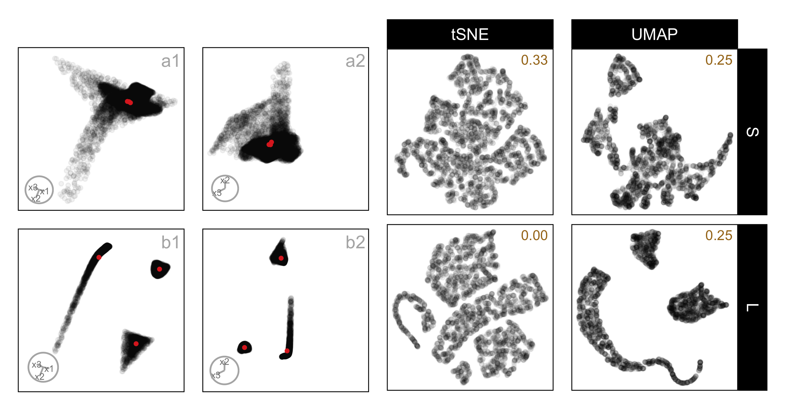
three_clust_07, composed of a nonlinear hyperbola, a hemisphere, and a triangular pyramid, shown under small and large cluster separation. Panels (a1–a2) show two fixed 2\text{-}D projections at small separation, and panels (b1–b2) show the same projections at large separation; the corresponding tSNE and UMAP layouts are shown in the right panels. For each NLDR layout, the proportion of correct identifications for the corresponding method and distance factor is reported in the top-right corner of the plot. At a small separation, curved and rounded components overlap substantially in both methods, making the structure difficult to distinguish. With increased separation, UMAP yields smoother, more continuous representations that retain the curvature of the hyperbolic component and improve spacing between clusters. In contrast, tSNE bends and breaks the hyperbolic structure and introduces irregular gaps between points, weakening global shape cues.
A different pattern is seen for the data set three_clust_13, which consists of a curvy cylinder, a cube, and a blunted cone, shown under small and large separation. (The total number of evaluations for each case was 3, 5, 6, and 6, respectively. While there are relatively few evaluations for any single example like this one, the figure is intended to illustrate a general pattern observed across multiple data sets.) Here, tSNE aligns more closely with the tour, particularly under small separation, where the proportion of correct responses is higher for tSNE (0.67) than for UMAP (0.00). In these layouts, tSNE preserves the overall grouping without introducing artificial splits, making it easier to reconcile the embedding with the linear projections. UMAP, on the other hand, emphasizes shape and density in ways that depart from the tour, especially when clusters are close together, leading to lower accuracy. Even at large separation, where UMAP improves (0.60), the visual cues remain less consistent with the tour than those produced by tSNE. This example highlights that which method leads to better conceptual alignment can depend strongly on the underlying data structure, and that neither embedding consistently dominates across all cases.
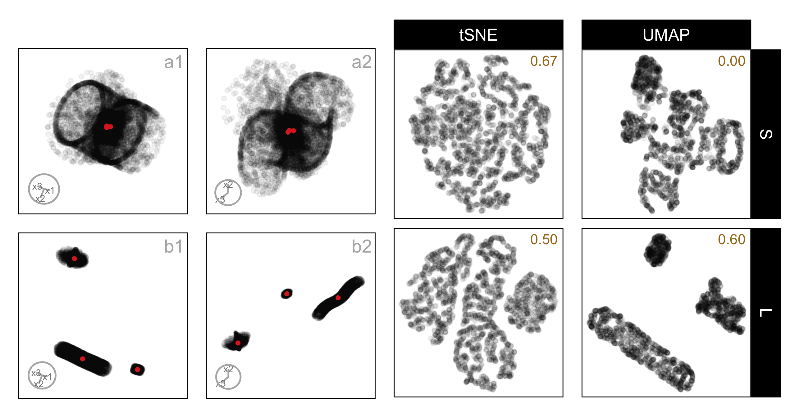
three_clust_13, composed of a curvy cylinder, a cube, and a blunted cone, shown under small and large cluster separation. Panels (a1–a2) show two fixed 2\text{-}D projections at small separation, and panels (b1–b2) show the same projections at large separation; the corresponding tSNE and UMAP layouts are shown in the right panels. For each NLDR layout, the proportion of correct identifications for the corresponding method and distance factor is reported in the top-right corner of the plot. At small separation, the cube and blunted cone partially overlap in the linear projections, but tSNE preserves their separation more clearly than UMAP, leading to a higher proportion of correct responses. With increased separation, both methods improve in interpretability; however, UMAP still compresses the curvy cylinder toward the other components, while tSNE maintains clearer boundaries between the three clusters, supporting more consistent identification across separation levels.
5.5 Limitations
One of the main drawbacks of visual experiments is their reliance on human judgments. In this context, the effectiveness of identifying the 2\text{-}D NLDR plot and the tour from the same data can be dependent on the perceptual ability and visual skills of the individual. However, when the results from multiple individuals are combined, the overall quality and robustness of the outcome are considerably higher.
A further limitation is that NLDR methods are typically designed for users with some understanding of their underlying principles. This study examines purely intuitive, visual use without any such training, so the findings reflect how these layouts are perceived visually rather than how they would be interpreted by a trained expert.
In this study, we chose to use only three clusters, each with unique shapes, and placed two close together with the third located farther away. We also used different sample sizes for each cluster. The purpose was to ensure a manageable experiment as an initial project. Using 4\text{-}D data allows tours to convey structural information effectively without imposing excessive cognitive or visual load on viewers. Some of the results should hold for more clusters, different arrangements, and higher dimensions, but it would be interesting to expand the scope to check these factors in the future.
5.6 Conclusions
This study examined whether people can correctly identify that a static 2\text{-}D NLDR layout and a dynamic tour represent the same high-dimensional data, and how this ability depends on both cluster separation and the NLDR method used. Using three clusters with different shapes, numbers of points, and unequal separation, we were able to directly test whether increasing high-dimensional separation improves perceptual identification, and whether this effect varies across methods.
The results show that cluster separation does matter, but its impact is strongly method-dependent. The results show that UMAP and tSNE lead to significantly different conceptualizations as the distance between clusters increases. There is a hint that PaCMAP behaves like UMAP, and PHATE behaves like tSNE, and TriMAP conceptualization is not affected by distance, but these are not statistically significant patterns.
This experiment is best viewed as a template for further studies on how people interpret NLDR layouts. Future work could extend the factors studied by considering different numbers of clusters, sample size, varying noise levels, and dimensionality. The current statistical model did not include a dataset-level random effect, as the number of repeated observations per dataset was insufficient to reliably estimate this additional variance component; future studies with a larger number of trials per dataset could explicitly model dependence between responses on the same data. For three clusters, including PCA (a linear method) as an embedding is not necessary because almost always it makes a useful display of three clusters in 2\text{-}D that is easily recognized as the same data when viewed with a tour. PCA is not needed to reveal three clusters; we included it as a positive control. PCA provides a case where the embedding is expected to closely match the tour, helping confirm that participants can correctly identify the same data when distortions are minimal. This makes it easier to interpret errors observed for nonlinear methods, where mismatches are more likely. For more than three clusters, this would not be true, and it would be important to include PCA as a comparison method.
Overall, this work highlights the need for more experiments that systematically assess the perception of structure in 2\text{-}D NLDR layouts with respect to structure present in high-dimensional data. With results from more human subject experiments, it may be possible to develop better metrics that could be used to automate the assessment of visual similarity measures. These would be helpful to use alongside NLDR layouts to assist with providing more faithful representations.
5.7 Supplementary materials
The appendix provides additional details on the experimental materials and process, including the three-cluster data structures, 2\text{-}D NLDR layouts, inter-cluster distance metrics, and the data collection and analysis processes, along with links to videos and scripts.
5.8 Acknowledgments
A pilot study was conducted with sample subjects from the working group of the Department of Econometrics and Business Statistics, Monash University. This pilot study allowed us to estimate the study’s completion time and the effect size and fine-tune the application.
These R packages were used for the work: tidyverse (Wickham et al. 2019), lme4 (Bates et al. 2015), broom.mixed (Bolker and Robinson 2024), ggbeeswarm (Clarke et al. 2023), emmeans (Lenth 2025), patchwork (Pedersen 2024), colorspace (Zeileis et al. 2020), kableExtra (Zhu 2024), conflicted (Wickham 2023), Rtsne (Krijthe 2015), umap (Konopka 2023), phateR(Moon et al. 2019), reticulate (Ushey et al. 2024), langevitour (Harrison 2023), binom (Dorai-Raj 2022), gridExtra (Auguie 2017), shiny (Chang et al. 2025), shinydashboard (Chang and Borges Ribeiro 2025), shinythemes (Chang 2021), bslib (Sievert et al. 2025), shinyjs (Attali 2021), DT (Xie 2016), googledrive (D’Agostino McGowan and Bryan 2025), googleAuthR (Edmondson 2024), googlesheets4 (Bryan 2025), shinyalert (Attali and Edwards 2024), shinypop (Meyer and Perrier 2024), randomNames (Betebenner 2024), shinyfullscreen (Bacher 2021), shinyWidgets (Perrier et al. 2025), hms (Müller 2025), shinythemes (Chang 2021), and shinycssloaders (Attali and Sali 2024). These Python packages were used for the work: trimap (Amid and Warmuth 2022) and pacmap (Wang et al. 2021).